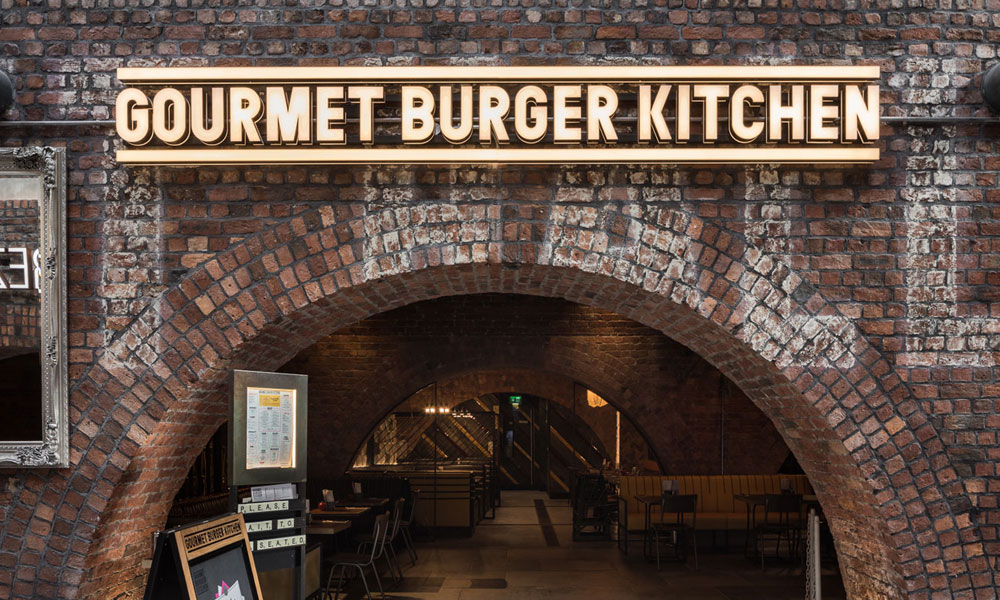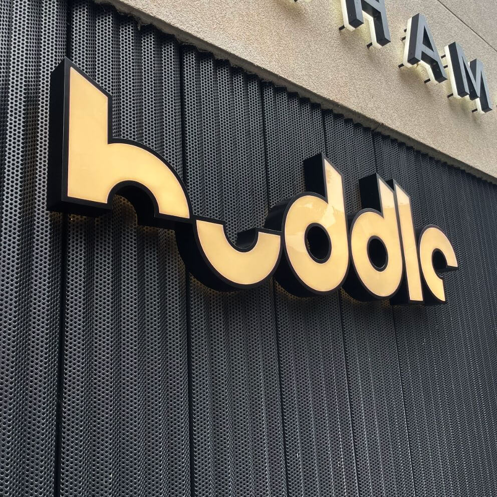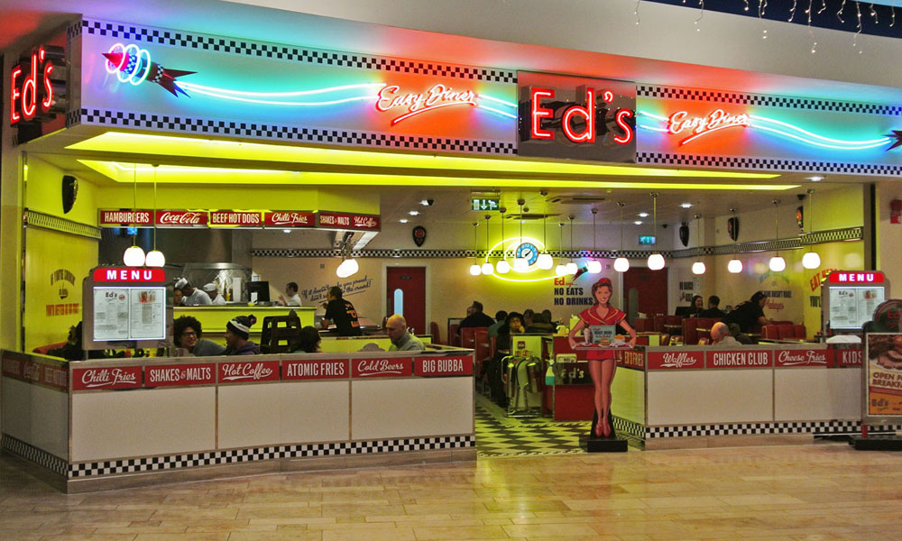
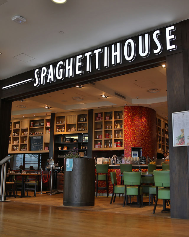
Built-up letters give a sign physical depth, creating shadows, highlights and a more architectural appearance than flat graphics. They are widely used for retail signage, office receptions, hotels, restaurants and leisure venues because they can be tailored to suit almost any brand or building.
Although the finished result may look simple, each letter is a fabricated object. Its face, sides, internal structure, finish and fixing method must work together. Exterior letters also need to withstand weather, changing temperatures and wind, while illuminated versions require reliable electrical components and access for future maintenance.
Understanding the main construction options helps businesses choose letters that suit the location, achieve the intended finish and continue looking premium over time.
What Makes a Letter “Built-Up”?
A built-up letter has a face and a return, which is the side section that gives it depth. The face and return are formed or fabricated separately and then joined to create a three-dimensional shape.
This is different from flat-cut lettering, which is produced from a single sheet of metal, acrylic or another material. Flat-cut letters can still stand away from a wall using raised fixings, but the material itself remains relatively slim.
Built-up construction provides greater visual weight and can accommodate internal illumination. Returns may be shallow for a refined interior sign or considerably deeper for large exterior shop signage.
Letter size, typeface and depth must be considered together. Very narrow strokes, tight curves and small internal spaces can restrict fabrication or make lighting uneven. A signage designer may make subtle technical adjustments while preserving the character of the brand typeface.
Built-Up Metal Letters
Aluminium and stainless steel are among the most common choices for fabricated lettering. Both provide strength, durability and a high-quality appearance, although they offer different advantages.
Aluminium is relatively lightweight, making it suitable for large letters and installations where reducing load is important. It can be folded, welded and finished in an extensive range of colours. Its resistance to corrosion makes it a practical option for exterior retail signage when specified and coated correctly.
Stainless steel provides a particularly crisp, premium finish. Brushed stainless steel has a subtle linear texture, while polished steel creates a brighter, more reflective appearance. Other specialist finishes can introduce warmer tones or darker architectural effects.
Metal letters may have metal faces and returns, or they can be combined with acrylic faces when illumination is required. Fabrication quality is important because poor welds, visible joins or uneven returns become noticeable on close-viewed signs.
The selected grade and finish should reflect the environment. Coastal air, pollution and frequent handling may require additional consideration to prevent staining or premature deterioration.
Acrylic Letter Construction
Acrylic is widely used for illuminated lettering because it can transmit and diffuse light. It is available in numerous colours, opacities and thicknesses, allowing designers to create face-lit, edge-lit and specialist effects.
In a typical face-illuminated letter, an acrylic face is fitted to metal or acrylic returns containing LED modules. The material helps spread the light across the surface, reducing bright spots and dark areas.
Acrylic can also be fabricated into complete letter forms for some internal applications. These may suit reception areas, feature walls and environments where the letters are viewed at close range.
The material needs to be selected for its intended use. Exterior-grade acrylic and suitable adhesives help manage weather exposure and temperature changes. Extremely thin strokes can be fragile, while large faces may require internal support to remain stable.
Colour appearance should be checked both illuminated and unlit. Some acrylics change character when the LEDs are switched on, so samples can prevent unexpected results after manufacture.
Composite and Mixed-Material Letters
Composite materials can provide an economical and lightweight alternative for certain designs. Aluminium composite, for example, consists of thin metal skins around a core and can be routed, folded or used as letter faces and backing components.
Composite is particularly effective for larger shapes, tray systems and signs where reducing weight helps simplify handling. However, exposed edges and tight curves require careful detailing if the finished letters are intended to look premium.
Built-up letters frequently combine materials rather than relying on one throughout. A metal return may provide strength, an acrylic face may diffuse illumination and a separate rear panel may support halo lighting.
This mixed construction allows the sign maker to choose each material according to its function. It can also balance appearance, weight and budget without compromising the most visible parts of the sign.
The proposal should specify what each element is made from. Descriptions such as “metal-effect letters” can refer to very different constructions and should be clarified when comparing quotations.
Painted and Powder-Coated Finishes
Paint allows aluminium letters to match brand colours and coordinate with surrounding shop signage. Accurate colour references should be provided, although businesses should remember that printed, screen and painted colours can appear different under changing light.
Wet-spray finishes can create smooth, detailed colour across complex forms. The correct preparation, primer and topcoat are essential, especially for exterior installations. A clear protective coating may be recommended for particular locations or effects.
Powder coating creates a tough finish and is available in many standard and custom colours. Matt, satin and gloss levels change how the letter responds to light. Matt finishes can feel contemporary and reduce reflections, while gloss surfaces create greater colour intensity but may show imperfections more readily.
Dark colours exposed to direct sunlight can become hot, affecting materials and adhesives if the construction has not been designed accordingly. The sign maker should consider both appearance and environmental performance when recommending a finish.
Natural and Specialist Metal Finishes
Natural metal surfaces provide depth that cannot always be reproduced with paint. Brushed, polished, aged, patinated and blackened finishes can all create distinctive results.
The direction of a brushed grain should remain consistent across every letter. Polished metal needs careful positioning because reflections may affect readability or produce unwanted glare. Fingerprints and cleaning marks are also more visible on highly reflective surfaces.
Specialist finishes often vary slightly from one piece to another. This natural variation may be part of their appeal, but samples should be approved so everyone understands the intended result.
Some finishes change over time, particularly when installed outdoors. Protective lacquers can slow this process, while intentionally living finishes are designed to develop character. Maintenance expectations should be agreed before production.
Face-Lit, Halo-Lit and Non-Illuminated Options
Built-up letters do not have to be illuminated. Non-illuminated metal letters can create strong shadows in daylight and may be the most appropriate option for interiors, heritage buildings or well-lit locations.
Face-lit letters direct light through the front surface, producing clear visibility and strong colour. Halo-lit letters project light backwards onto the mounting surface, creating a glow around each shape. Some designs combine both effects.
The wall finish has a major influence on halo lighting. Smooth, light-coloured surfaces reflect illumination more evenly than dark brick, heavily textured stone or reflective panels. The distance between the letter and wall also affects the spread of light.
LED colour temperature, brightness and module spacing should be tested. More light is not always better; controlled illumination usually produces a cleaner, more premium result.
Choosing the Right Fixings
Fixings must support the letters securely while preserving the design. The correct method depends on letter weight, wall construction, installation height and whether electrical access is required.
Letters may be fitted individually using threaded studs and spacers. This creates a clean appearance but requires precise templates and careful drilling. Rails or trays can reduce the number of fixings into the building and simplify electrical connections, although they introduce a visible background element.
For shop signage mounted to cladding, brick or stone, the installer must understand what lies behind the finished surface. Fixing only into a decorative outer layer may not provide adequate support.
Cable routes, transformers and access panels should be planned before installation. Concealed services produce a neater result, but maintenance must remain possible without removing large areas of the frontage.
Premium Results Begin Behind the Face
The quality of built-up letters depends on details that may not be obvious in a design visual. Material thickness, internal supports, welded joints, paint preparation and electrical access all influence how the sign performs.
Accurate surveys and full-size samples help confirm scale, colour and depth. Professional installation then ensures consistent spacing, secure fixings and neat cable management.
Whether used for understated reception lettering or prominent exterior retail signage, built-up letters can give a brand genuine architectural presence. Choosing suitable materials, finishes and fixings ensures that the result does not merely look impressive when installed, but continues to represent the business well for years.