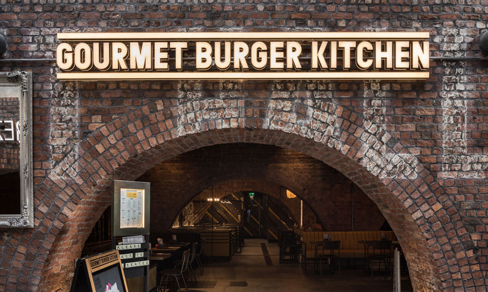
A heritage building or conservation-area property can provide a business with character that a modern unit cannot easily reproduce. Original shopfronts, stonework, brickwork and traditional streetscapes all contribute to a strong sense of place. However, these qualities also make signage design more sensitive.
Standard illuminated boxes, oversized fascias and extensive window graphics can appear out of proportion or obscure architectural details. Proposals may also require advertisement consent, planning permission or listed building consent, depending on the building, location and nature of the work.
Successful signage must promote the business without competing with the property. By researching the site, choosing sympathetic materials and consulting the local authority early, it is possible to create signs that are distinctive, practical and appropriate for their surroundings.
Understand What Is Being Protected
A conservation area is designated because of its special architectural or historic interest. Protection usually concerns the character of the wider area, not only individual landmark buildings. Shopfronts, upper floors, rooflines, materials and traditional details can all contribute to that character.
A listed building has its own legal protection, and attaching a sign may affect historic fabric even when the sign appears modest. Drilling into stone, removing an original fascia or routing electrical cables through the structure can require careful assessment.
Before design begins, establish whether the property is listed, locally listed or inside a conservation area. Check whether additional local controls or design guidance apply. The landlord may also have separate conditions regarding alterations.
An experienced signage company can help identify the likely constraints, but formal confirmation should come from the relevant planning or conservation authority. Requirements vary between locations, so approval granted for a neighbouring premises should never be treated as automatic permission.
Read the Building Before Applying the Brand
A strong heritage design begins with the architecture. Look at the proportions of the shopfront, the depth of the fascia, the position of pilasters and cornices, and any surviving historic lettering or decorative details.
The sign should fit within this structure rather than covering it. A fascia that is too deep can make the ground floor appear disconnected from the rest of the building. Lettering extending beyond the natural signboard may interrupt the rhythm of the street.
This sometimes requires adapting normal brand applications. A full-colour logo with a large background panel might become individually applied letters in an approved colour. A national business may use the same typeface and core identity while adjusting the scale, materials or illumination to suit the property.
Adaptation does not necessarily weaken a brand. A carefully considered sign can look more distinctive because it feels genuinely connected to its setting.
Choose Materials with Texture and Longevity
Traditional streetscapes generally respond well to materials that have depth, texture and a sense of craftsmanship. Painted timber fascias, metal letters, hand-applied signwriting and modest hanging signs may all be appropriate, depending on the building.
Materials should not attempt to create false history. Artificially distressed finishes and decorative details without any relationship to the property can appear contrived. The aim is to respect the building, not turn every business into a historical reproduction.
Modern materials are not always unsuitable, but their finish and construction need care. Highly reflective plastics, bulky boxes and glossy panels can dominate an older frontage. A slimmer, matt-finished solution may sit more comfortably while still offering durability and accurate branding.
Maintenance should be considered from the outset. Peeling paint, corroded brackets and failed lighting harm both the business and the surrounding streetscape. Suitable coatings and accessible components help the signage retain its intended appearance.
Keep Lettering Proportionate and Legible
Heritage signage often benefits from restraint, but restraint should not make the business difficult to identify. Lettering must remain clear from the normal viewing position and provide enough contrast with the fascia.
Typefaces should complement the building without becoming theatrical. A traditional serif or signwritten style may work in some locations, while a simple contemporary face can create an effective contrast in others. Highly ornate lettering is difficult to read and may make the frontage look less authentic.
Spacing is particularly important. Individually fitted letters need sufficient room to sit comfortably within the fascia, with clear margins around architectural edges. Trying to include a long slogan, service list and contact details usually creates clutter.
The primary signage should concentrate on the business name and essential identity. Supporting information can be placed discreetly on windows, doors or an internal display where local guidance permits.
Use Illumination with Restraint
Illuminated signs can be important for restaurants, hotels, theatres and other businesses operating after dark. In a conservation area, however, the intensity and method of illumination are likely to receive close attention.
Internally illuminated boxes can appear overly bright and bulky against a traditional frontage. More subtle options include concealed trough lighting, carefully positioned spotlights or a small number of discreet fittings that wash light evenly across the sign.
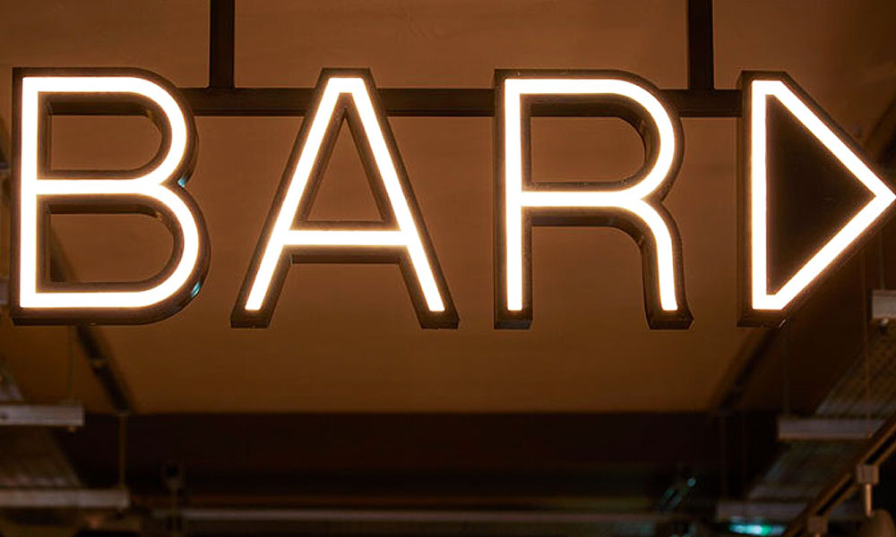
Halo illumination behind individual letters may be suitable in some settings if the glow is soft and the components remain visually unobtrusive during the day. In other locations, the authority may prefer external lighting or no illumination at all.
Colour temperature matters. Warm white light often sits more comfortably alongside traditional materials than a very cool or blue-white source. Brightness should be sufficient for legibility without spilling into upper-floor windows or overwhelming neighbouring premises.
All cables, transformers and mounting hardware should be integrated carefully. Even attractive illuminated signs can fail visually if their supporting equipment is left exposed.
Avoid Clutter Across the Frontage
One well-designed fascia and a modest hanging sign will often have greater impact than several competing elements. Repeated logos, banners, window coverings and pavement signs can obscure the shopfront and weaken the character of the street.
Projecting signs should be proportionate to the building and mounted in a position that respects existing features. Traditional brackets can be appropriate, although their design should respond to the property rather than introduce unnecessary decoration.
Window graphics require similar restraint. Covering large areas of glass reduces the connection between the interior and street, while numerous stickers can make an otherwise considered frontage feel temporary.
Review every proposed element together. A fascia that looks balanced in isolation may become excessive once menu cases, lighting, security equipment and promotional displays are added.
Prepare a Clear Application
Local authority officers need enough information to understand exactly what is proposed. A strong submission usually includes location and site plans, existing and proposed elevations, accurate dimensions, colours, materials and fixing details.
For illuminated signage, provide the lighting method, brightness, colour temperature, operating hours and position of associated equipment. Photomontages or realistic visualisations can show how the completed sign will relate to the building and neighbouring frontages.
Listed buildings or sensitive sites may require additional heritage information explaining the significance of the property and how the design avoids harm. Photographs of existing features and details of any removal work can strengthen the submission.
Do not manufacture the sign until the necessary approvals are confirmed. Altering completed components after receiving feedback can be expensive, while installing without consent can lead to enforcement action and removal.
Respond Constructively to Local Authority Feedback
Early discussion with planning or conservation officers can reveal concerns before the application is finalised. They may recommend reducing the size, changing the material, removing an illuminated element or repositioning fixings to protect historic fabric.
Feedback should be treated as part of the design process rather than an obstacle. Ask which aspect creates concern and whether an alternative could meet both the business need and heritage objective.
Providing samples can be useful where colour, reflectivity or material quality is difficult to judge from drawings. If changes are agreed, update every plan and visual consistently so the submission does not contain conflicting information.
Creating a Sign That Belongs
The best signage in a heritage setting does not disappear, but neither does it overwhelm the building. It identifies the business clearly while preserving the features that make the location valuable.
Thoughtful proportions, durable materials and subtle illuminated signs can create an effective balance between commercial visibility and architectural character. Early research and a well-prepared application also make local authority discussions more productive.
By treating the building and streetscape as part of the brief, businesses can achieve signage that feels considered rather than compromised—and that continues to look appropriate for many years.