An office can communicate a great deal about an organisation before anyone speaks. The reception area, meeting rooms, corridors and shared spaces all influence how clients, employees and potential recruits understand the business.
Internal branding should involve more than placing a large logo behind reception. A successful scheme translates the organisation’s visual identity, values and personality into the physical environment. It helps people navigate the building, establishes a consistent atmosphere and makes different spaces feel connected.
Wall graphics, office signs and carefully integrated wayfinding can all contribute, but the strongest results come from treating them as one coordinated system. Every element should have a purpose, work with the interior design and support the experience the organisation wants to create.
Start with the Brand, Not the Available Walls
It is tempting to begin by identifying empty surfaces and deciding what can be placed on them. This often results in disconnected graphics that fill space without saying anything meaningful.
Instead, return to the core brand. Consider its values, tone of voice, visual identity and relationship with employees and customers. A technology business may want its office to feel inventive and energetic, while a legal or financial organisation may prioritise confidence, precision and discretion.
Not every brand asset needs to appear throughout the building. Repeating a logo on every wall can weaken its impact. Colours, typography, imagery, language and materials can communicate identity more subtly.
The aim is to create a recognisable atmosphere rather than turn the workplace into an advertisement. The best corporate signs feel naturally connected to the architecture and the way the office is used.
Use Zoning to Give Spaces a Clear Identity
Modern offices often contain reception areas, quiet rooms, meeting suites, collaboration zones and social spaces. Zoning helps employees and visitors understand these different environments.
Brand colours can distinguish floors or departments, while variations in wall graphics can give meeting room groups their own identity. Materials and lighting may reinforce the change between formal client areas and more relaxed staff spaces.
The system should remain controlled. Giving every room a different colour, typeface and decorative theme can create confusion rather than clarity. Each zone should belong to the same overall visual family.
Zoning can also support behaviour. Calm colours and restrained graphics may suit focused work areas, while more energetic imagery can bring life to collaboration spaces. Large-scale patterns can identify social areas without requiring prominent signs.
When visual cues are planned alongside office signs, people begin to recognise destinations before they read the room name or directional information.
Keep Typography Consistent
Typography is one of the strongest links between brand communication and physical space. The same type family used in marketing materials can create consistency across directories, door signs, feature walls and environmental graphics.
However, brand typography must still be practical. A decorative font that works in a headline may be unsuitable for room names or directions. Small lettering, fine strokes and tightly spaced characters can be difficult to read when viewed at a distance.
A signage system may therefore use different approved weights or a supporting typeface for functional information. The relationship should be defined clearly so that every sign does not become an individual design decision.
Capitalisation, punctuation and terminology should also remain consistent. If one floor uses “Meeting Room One” while another uses “MR-02”, the system can feel disjointed.
Typography should be considered as part of the interior rather than applied at the end. The size, spacing, colour and mounting method all affect whether lettering feels premium and properly integrated.
Make Wall Graphics Work at Architectural Scale
Wall graphics can transform plain office surfaces, but the design needs to respond to the size and shape of the space. Artwork created for a brochure or website may not work when enlarged across several metres.
Large graphics should be viewed from the normal approach and surrounding seating areas. Important details must not disappear behind furniture, screens or doors. The design should also account for sockets, switches, wall joints and changes in surface.
Options range from printed wallpaper and applied vinyl to dimensional lettering, fabricated panels and hand-painted graphics. The right choice depends on the desired finish, expected lifespan and condition of the wall.
A subtle pattern derived from the logo may provide texture without overwhelming a workspace. Photography can connect teams with customers, locations or products, while illustrated graphics can bring complex services to life.
Quality of production is particularly noticeable at scale. Accurate colour, carefully matched joins and clean installation make the difference between an intentional branded feature and a decorative covering.
Create Feature Walls with a Clear Purpose
A feature wall should communicate something that belongs in that particular location. Reception is usually the place for the primary identity, while staff areas may support more detailed stories about culture, history or shared achievements.
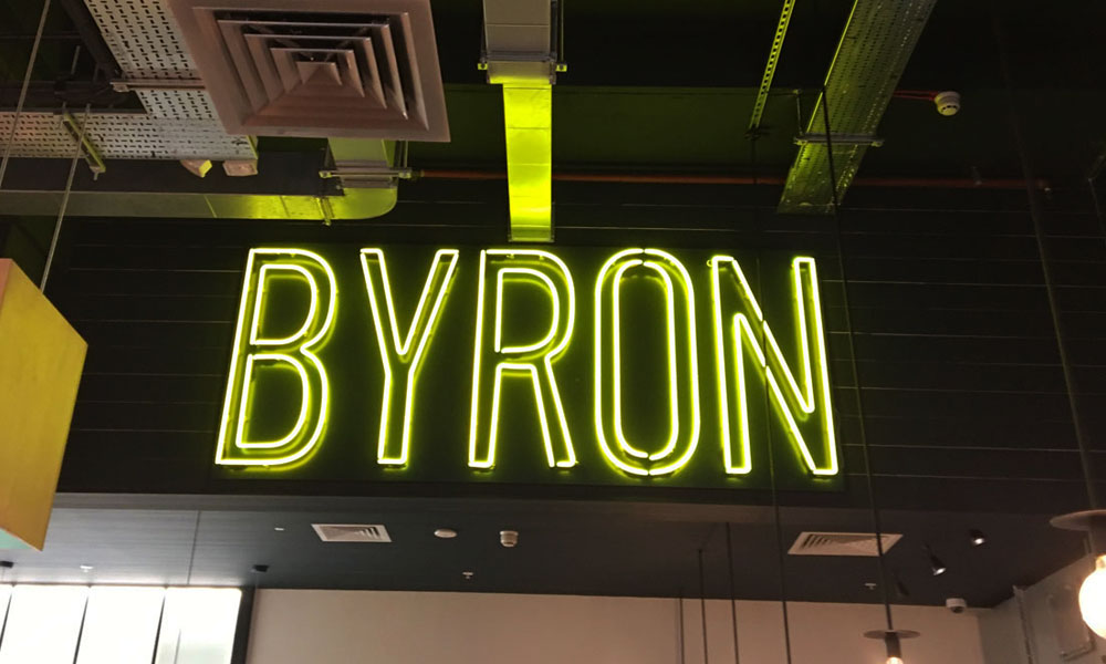
A corporate signs scheme might combine built-up letters with specialist metalwork, illumination or a textured background. The result can become a strong focal point without relying on excessive scale or bright colours.
In meeting rooms, feature walls can provide a professional background for video calls and presentations. The logo should be visible where appropriate but not positioned so that it is cropped, obscured or repeated awkwardly on camera.
Breakout areas offer more freedom. Graphics can celebrate local connections, illustrate company milestones or introduce themes linked to creativity and collaboration.
Each feature needs enough surrounding space to make an impact. Placing several statement walls close together can create visual competition and reduce the value of every element.
Use Culture Walls to Tell a Genuine Story
Culture walls can reinforce purpose and help employees understand how their work connects to the wider organisation. However, simply displaying generic values in oversized lettering can feel forced.
Strong culture walls use real material: significant dates, customer outcomes, employee contributions, archive photography or examples of work. They show evidence of the culture instead of only making claims about it.
The content should be concise enough to absorb while passing but detailed enough to reward closer attention. A timeline may suit a corridor, while employee stories could work well near a social or training area.
Design for future updates. Organisations change, and a culture wall can become dated if every element is permanently fixed. Replaceable panels or modular displays allow new achievements and stories to be added without rebuilding the whole installation.
Most importantly, the content must reflect employees’ actual experience. Internal branding cannot compensate for a culture that does not match the words on the wall.
Make Wayfinding Feel Part of the Interior
Directional signage is essential, but it does not need to look purely functional. Materials, colours and typography can connect wayfinding with the rest of the scheme while preserving clarity.
Premium wayfinding often relies on restraint. Individually applied lettering, slim projecting signs and carefully fabricated door plaques can provide direction without filling walls with large panels.
Consistency is vital. Arrows, room names, floor numbers and symbols should follow one system throughout the building. Information must appear at genuine decision points and remain visible from normal routes.
Contrast and letter size should never be sacrificed for style. A pale grey direction on a glass wall may look elegant in a visualisation but become unreadable in changing light. Accessible placement, tactile information and recognised symbols should be considered from the beginning.
Well-designed office signs guide people quietly. Visitors should reach their destination without having to study the system or repeatedly ask staff for help.
Plan Everything as One Interior System
Internal branding works best when signage designers become involved alongside architects, interior designers and fit-out contractors. Early coordination prevents signs from conflicting with lighting, artwork, wall finishes and furniture.
It also allows mounting points, power supplies and digital displays to be integrated before construction is complete. Material samples and full-size lettering tests can then be reviewed in the actual space.
A coordinated approach creates consistency while reducing late changes and improvised solutions. From the reception logo to the smallest room sign, every element can support the same identity and level of finish.
Thoughtful wall graphics, culture features and corporate signs do more than decorate an office. They make the workplace easier to understand, express what the organisation stands for and create an environment that feels coherent, confident and genuinely connected to the brand.