Does the colour you choose for your business signage make a difference? Speak to any psychologist and you’ll discover that different colours can actually elicit a variety of emotions. Blue can be calming for instance, while red can get us a little passionate and hot under the collar. If you have a clearly defined brand and want to create just the right response in your customer, colour choice is going to be important.
Sophie Robinson, interior designer, even runs courses exploring the power of colour psychology and why it is so important in design.
It’s not just about the walls and fixtures and fittings in your office, restaurant, hotel or store, it’s also the colour of your signs.
Bespoke Signage Colours
Here’s our quick guide on how different hues impact on our thoughts and feelings.
- Yellow: This can be quite a powerful colour when used in the right way but can also cause alarm. It’s often used on warning signs to attract attention, for instance. Softer, muted yellows, however, can have a natural, calming effect and could help your store stand out on the high street.
- Red: Bold and full of energy, it’s no wonder that red is one of the most used colours in both signage and marketing. The key is making sure that you balance it with other colours so that it doesn’t overpower your message.
- Green: It’s often associated with all things natural, particularly now that we’re all into recycling and saving the planet. This is a colour that’s popular with shops and businesses that have a close connection with personal health and wellbeing.
- Blue: It’s a colour used by many professional services because it’s thought to reflect a sense of trust and reliability. Blue can also be a pretty calming and centred choice, producing a peaceful ambience when you use it for interiors.
- Purple: If you want to create a sense of prestige, then going for the colour of the royals might be a great choice. For signage it can work well with elegant fonts but can seem overpowering if you get it wrong.
- Pink: It’s thought to attract females on a uniquely psychological level and the colour has become a favourite of retail stores in recent times. You can mix and match different hues from the shocking to the pale and understated to create strong and easily recognisable signage system.
- Orange: It’s often used by tech companies that want to attract attention but it can look and feel a little garish when it’s placed on a sign above your store door. Combining with other colours can help tone down the effect.
- Gold/Silver: Both are usually chosen to reflect a premier service for store that deliver above and beyond the standard fayre. It also works surprisingly well when you use gold with a colour like purple.
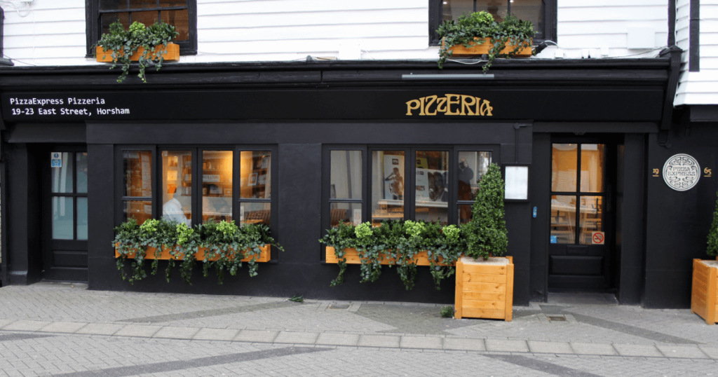
- Black: Of all the colours, black is the most versatile and perhaps the most widely used on shop store signage. It’s clean, no-nonsense and works well as a contrasting colour, particularly with white and generally instils a sense of authority and reliability.
Most graphic designers and marketers have a process called the 60-30-10 rule when it comes to designing things like logos and shop signage. That means they’ll use three colours, but in these specific proportions, to elicit a certain emotional or even physiological response.
Getting the balance right and choosing the appropriate colours is key to making sure you have signage both indoors and outside that creates the perfect psychological impact for your customers.
To discuss your signage or lighting requirement contact Technical Signs today for a no obligation discussion and quote.


