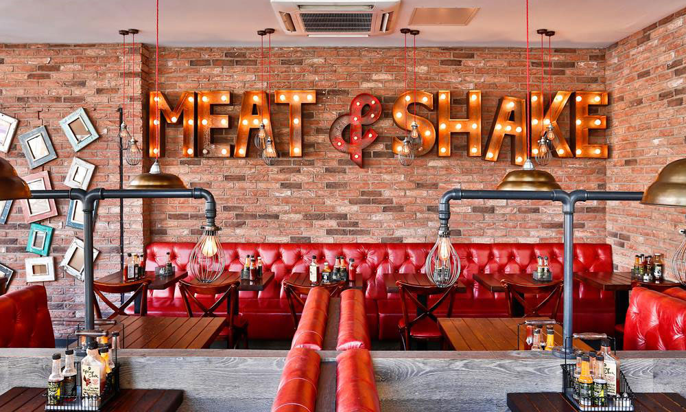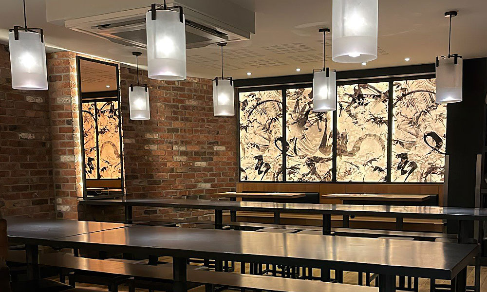
Light boxes have been a familiar part of the high street for decades, but modern versions can look very different from the bulky illuminated panels associated with older shopfronts. Slim profiles, efficient LEDs, carefully selected materials and more considered graphics allow them to become a refined part of a brand identity.
For retailers, hospitality venues and takeaway businesses, illuminated signage can maintain visibility after daylight fades and help customers identify a location quickly. The key is to balance brightness, placement and design rather than assuming that the largest or brightest sign will be the most effective.
Well-designed lightbox signs should feel integrated with the building and surrounding environment while remaining clear at the distance from which customers will actually view them.
How a light box works
A light box is an internally illuminated sign made from a cabinet, lighting system and visible face. LEDs inside the cabinet spread light across the surface so that the design remains visible in dark or low-light conditions.
The sign may be mounted flat against a fascia or wall, suspended inside a window or installed as a projecting sign. Some versions display a permanent logo, while poster light boxes allow printed graphics or menus to be changed.
Modern LED illumination makes slim designs possible and can provide more even coverage than older lighting systems. The cabinet can also be powder coated or finished to coordinate with the shopfront, helping the structure feel like part of the wider design.
Light boxes are versatile, but the correct specification depends on whether they will be used internally or externally, viewed head-on or from the side, and seen in daylight as well as darkness.
Choosing the right level of brightness
Brightness should be appropriate to the location. A sign on a well-lit city street may need enough output to compete with surrounding shopfronts, while the same specification could appear overpowering in a quieter conservation area or residential neighbourhood.
More brightness does not necessarily improve readability. Excessive illumination can make pale lettering flare, reduce contrast and create an uncomfortable glare. It may also make the sign appear cheaper rather than more prominent.
Uniformity matters just as much as output. Dark patches, visible LED points and bright edges distract from the graphic and can make even a new sign look poorly made.
Consider how ambient light changes throughout the day. A light box that looks balanced at dusk may feel too intense late at night. Where suitable, controls can reduce output during darker hours or operate the sign according to agreed opening times.
Local requirements and advertising consent should also be considered before installation, particularly for larger or prominently illuminated signage.
Understanding face materials
The face is the visible illuminated surface, and its material affects colour, durability and light distribution.
Opal acrylic is commonly used because it diffuses illumination and provides a clean, consistent background. Graphics may be applied using translucent vinyl or printed films designed to remain colourful when lit from behind.
Flexible face materials can suit larger sign boxes because they provide a continuous surface without requiring very large rigid sheets. They need correct tensioning to maintain a smooth appearance.
Fabric faces are often used for internal displays and premium retail environments. They can create an even, refined finish and may allow graphics to be replaced, depending on the system.
The material must suit its surroundings. External faces need resistance to weather, UV exposure and temperature changes, while internal signs may prioritise a slim profile and detailed print reproduction.
Colour should be tested under illumination. A printed shade can look significantly different when light passes through it, so physical samples and visualisation can prevent disappointing results.
Creating a modern design
Many dated light boxes share the same problems: oversized cabinets, crowded graphics, weak contrast and too much information.
A modern sign usually communicates one clear message. For permanent external signage, that is most often the brand name or logo. Telephone numbers, web addresses, opening hours and long service lists can make the face difficult to read.
Allow generous space around the lettering and use a type size appropriate to the viewing distance. Fine lettering may look elegant on screen but lose definition once illuminated and viewed across a street.
Contrast is essential. A dark background with illuminated lettering can feel more controlled than a fully glowing white panel, particularly for premium hospitality and retail brands. Alternatively, a restrained light face can work well when the typography is bold and simple.
The cabinet itself should be treated as part of the design. A carefully chosen depth, neat corners and a finish matched to nearby metalwork can transform the overall appearance.
Helping retail shops stand out
Retail lightbox signs can improve recognition during winter afternoons, evening trading and busy periods when surrounding visual competition is high.
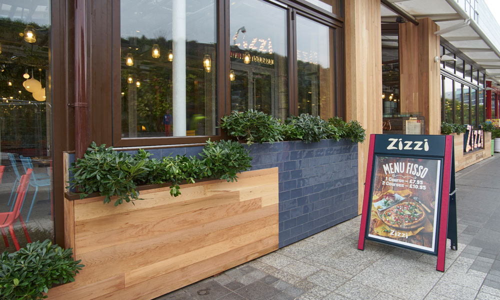
A fascia-mounted design provides clear identification from directly opposite the store. A projecting light box can be more useful on narrow streets because it is visible to pedestrians approaching from either direction.
Inside the shop, illuminated poster boxes can promote seasonal campaigns, product launches and events. Their brightness draws attention through the window without requiring a permanent change to the main fascia.
Placement should respect the window display rather than competing with it. A large glowing panel can obscure products or create reflections that make the interior harder to see.
Retailers with several branches should create a repeatable specification covering colour, materials, brightness and positioning. This maintains brand consistency while allowing each location to respond to its architecture.
Supporting hospitality atmosphere
Restaurants, cafés, bars and hotels need signage that attracts attention while setting an expectation about the experience inside.
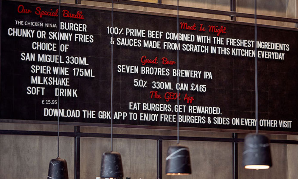
A warm, restrained light box can guide guests towards an entrance without undermining an intimate atmosphere. Internal illuminated menu displays can make information easier to read in softly lit spaces, while projecting signs help visitors identify venues along busy streets.
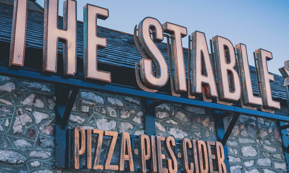
The design should complement the building materials and lighting scheme. Powder-coated metal, timber details, specialist finishes or layered graphics can prevent the sign from feeling like a standard plastic box.
Hospitality signage must also remain legible when the venue is busy. Avoid placing the main sign behind outdoor furniture, planting, umbrellas or queues.
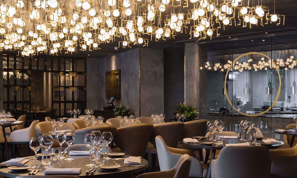
The best result often comes from coordinating signage with architectural and decorative lighting from the beginning of a fit-out.
Improving visibility for takeaway brands
Takeaway businesses depend on speed and clarity. Customers need to recognise the premises, understand the menu and find collection points without confusion.
A bright but controlled fascia light box can create strong street visibility, particularly during evening trading. Illuminated menu boxes help customers make decisions before reaching the counter, reducing pressure during busy periods.
Graphics should remain simple. Small photographs, extensive menus and multiple offers can become difficult to read through glass or from outside. Use a clear hierarchy and keep temporary promotions separate from the permanent brand sign.
Lightbox signs are also useful for identifying ordering, collection and delivery-driver areas. Consistent colours and concise wording can improve movement through the space.
Grease, traffic pollution and frequent handling may affect takeaway signage, so accessible surfaces and a practical cleaning plan are especially important.
Choosing the best position
A site survey should consider sightlines, passing direction, viewing distance and surrounding obstructions. The obvious central position is not always the most visible.
Fascia signs work well for traffic approaching from the front, while projection signs address pedestrians moving parallel to the building. Window-mounted units can suit businesses with planning or structural limitations, although reflections need careful assessment.
Mounting height affects both visibility and maintenance access. The sign must also allow safe cable routes, secure fixings and appropriate weather protection.
Before manufacture, scaled drawings or visualisations can show how the light box relates to the shopfront, neighbouring signs and architectural features.
Keeping illumination crisp over time
Even excellent signage can look dated when dirt collects on the face, graphics fade or individual LEDs fail. Regular inspection helps identify problems before the brand appears neglected.
Clean the face using methods suitable for its material, and remove insects or debris that may collect inside accessible units. Check seals, drainage, fixings and electrical components, particularly after severe weather.
Printed graphics and vinyl may eventually require replacement even when the cabinet remains sound. Updating the face can refresh a campaign or brand without manufacturing an entirely new structure.
LED modules should be correctly specified and positioned so that replacements maintain consistent colour and brightness.
A familiar sign with a contemporary role
Light boxes remain effective because they combine branding and illumination in one practical format. Their success depends on thoughtful choices rather than maximum size or brightness.
The right face material produces even colour, suitable placement improves visibility and a restrained graphic keeps the message readable. Slim cabinets, controlled LEDs and quality finishes allow lightbox signs to complement contemporary retail, hospitality and takeaway interiors.
With professional design, manufacture and maintenance, illuminated signage can remain sharp, relevant and recognisably on-brand for years rather than becoming another dated panel on the high street.