Large-format signage is designed to be noticed from further away, but size alone does not make a sign effective. A large panel can still fail if the lettering is too small, the contrast is weak or the message contains more information than people have time to process.
The correct design depends heavily on how the sign will be viewed. A pedestrian may have several seconds to read a shop fascia or wayfinding sign, while a driver approaching a site at speed may have only a brief opportunity to notice, understand and act on the information.
Letter height, typeface, colour, placement and surrounding conditions must all work together. Careful planning is particularly important for bespoke signage, where the design should respond to the building, brand and audience rather than simply enlarging artwork created for another purpose.
Begin with the Viewing Distance
The further away the audience will be, the larger the lettering needs to become. This sounds obvious, but signs are often assessed on a computer screen or viewed at close range in a workshop. Under those conditions, small text may appear perfectly clear even though it will disappear once installed several metres above ground.
A useful starting point is to allow approximately 25mm of capital letter height for every three metres of comfortable viewing distance. This would suggest letters of roughly 75mm for viewing at nine metres and around 250mm for viewing at 30 metres.
This is only a general guide. Lighting, typeface, contrast, weather and the viewer’s speed can all change what is required. Lowercase lettering also needs careful consideration because its smaller central body can reduce apparent size, even when the capital height meets the calculation.
A professional site survey allows the signage company to check likely viewing points and test the design at scale. For important exterior signs, physical samples or full-size printed sections can provide a more reliable assessment than an on-screen visual alone.
Allow More Reading Time for Drivers
Viewing distance is only part of the calculation. A driver travelling past a sign has less time to find and understand it than someone approaching on foot. The design must account for speed, traffic conditions and the decisions the driver needs to make.
A sign identifying a building can sometimes be read as the vehicle passes. Directional signage must be visible much earlier because the driver needs time to understand the instruction, signal, slow down and turn safely.
Lettering for drivers should therefore be larger than the minimum suggested by distance alone. The message should also be extremely concise. A business name, arrow and short destination may be useful; a detailed list of departments, services and contact information is unlikely to be read safely.
Repetition can be more effective than one overloaded sign. An advance sign might identify the entrance, followed by a second sign that confirms the route and a final sign that directs visitors towards parking or reception.
Design for Pedestrian Behaviour
Pedestrians move more slowly and may be able to stop, but this does not mean every sign should contain large amounts of information. People walking through a busy street, shopping centre or venue are still surrounded by visual competition.
A pedestrian sign can support smaller lettering and more detail when it is positioned at eye level and designed for close viewing. Opening times, directories and menus may all work well in this format. However, the most important information should remain easy to identify at a glance.
Pedestrians may approach from several directions, so orientation matters. A fascia that reads clearly from directly opposite may be difficult to see for people travelling along the pavement. A projecting sign can improve visibility by presenting the brand at a right angle to the building.
In complex spaces, bespoke signage can create a hierarchy that serves different viewing distances. Large overhead signs establish the destination, medium-sized directional signs guide movement and close-range panels provide detailed information.
Choose Letterforms for Clarity
Decorative typefaces can express personality, but they are not always suitable for information that must be read quickly. Fine strokes, tightly spaced characters and highly stylised forms can become unclear at distance.
Simple letterforms with distinct shapes generally provide better legibility. This does not mean every sign must use an identical sans serif font. Brand typefaces can often be adapted successfully by adjusting weight, spacing and scale.
Uppercase letters can work well for short names and headings, but long passages in capitals are more difficult to scan because the words create similar rectangular shapes. A combination of upper and lowercase lettering may be more readable for directions and supporting information.
Spacing is as important as letter height. Characters placed too close together can merge when viewed from a distance, while excessive spacing makes words harder to recognise. Adequate space between lines also prevents separate messages from becoming visually confused.
Use Contrast to Separate the Message
Strong contrast helps lettering remain visible as distance increases. Dark text on a light background or light text on a dark background usually provides clearer separation than colours with similar brightness.
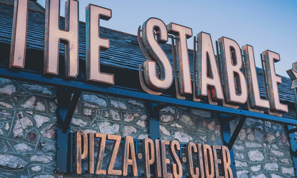
Colour choices that look attractive in brand guidelines may not perform effectively on a building. Sunlight, shadows, reflections and nearby materials can all affect visibility. A mid-grey logo mounted on weathered concrete, for example, may lose definition even if the combination appears elegant in a digital mock-up.
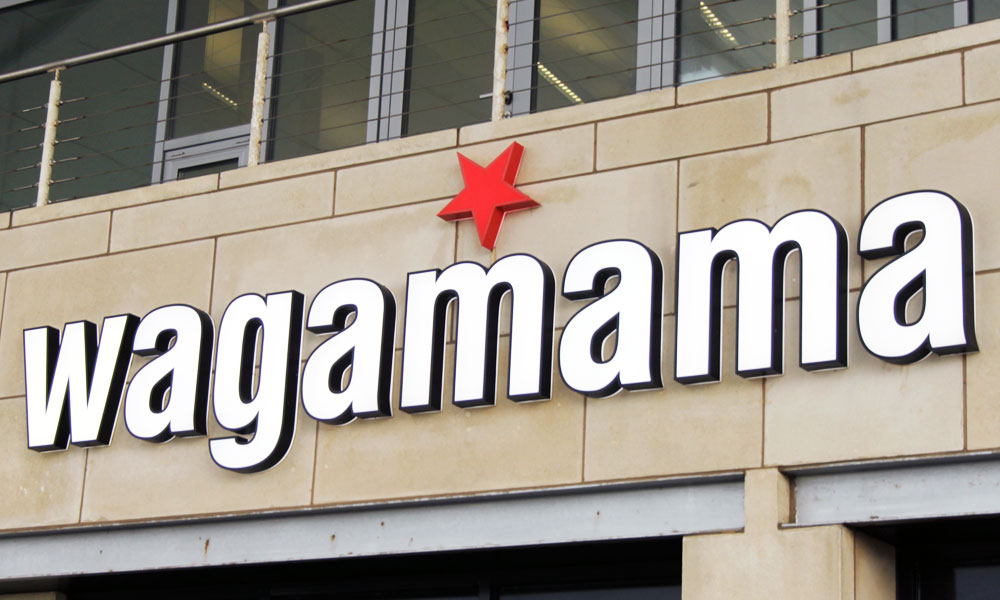
Contrast should also be considered at night. Illuminated letters can appear thinner when very bright light spreads beyond their edges, while poorly controlled background lighting may reduce their impact. The colour temperature and brightness of surrounding streetlights can change the way the sign is perceived.
Outlines, backing panels or contrasting returns can help separate lettering from a complicated surface without abandoning the brand palette.
Position the Sign Around Real Sightlines
The best-designed sign will not work if it is hidden behind a tree, parked vehicle, street furniture or another building. Placement should be based on how people genuinely approach the site rather than where there happens to be an available wall.
Signs mounted high on a building may be visible from a long distance but difficult to read from immediately below. Low signs can work well for drivers but may be obscured by traffic. Curves, junctions and changes in elevation can also shorten the viewing window.
A survey should assess sightlines at different times and from relevant directions. Seasonal changes matter too. Trees that create no obstruction in winter may hide a sign once in leaf, while outdoor seating, promotional displays and delivery vehicles can alter visibility during trading hours.
Planning requirements, landlord conditions and safe fixing points will also influence placement, making early consultation valuable.
Keep the Message Focused
Every additional word increases the time required to read a sign. Large-format signage should therefore communicate one main purpose clearly rather than attempt to reproduce a brochure.
For a primary identification sign, the brand name may be enough. A roadside directional sign might include the destination, arrow and necessary distance. Contact details, slogans and service lists should only be added when people will genuinely have time to use them.
Visual hierarchy helps when several elements are necessary. The most important message should have the largest lettering and strongest contrast, with secondary information clearly subordinate. If every element competes for attention, none of them will be absorbed quickly.
Test Before the Sign Is Made
Accurate visualisation prevents costly mistakes. The proposed design should be placed into photographs of the site and viewed at realistic scale. Full-size samples can then test letter height, colour, finish and illumination.
Testing should reflect actual conditions rather than one ideal viewpoint. Review the sign from a moving vehicle where safe, from both directions along the pavement and during daytime and evening hours. Someone unfamiliar with the project can provide particularly useful feedback because they do not already know what the sign says.
Effective bespoke signage balances brand character with practical readability. By designing around real distance, speed and sightlines, businesses can create large-format signs that do more than occupy space. They can be noticed, understood and acted upon in the few seconds that matter.