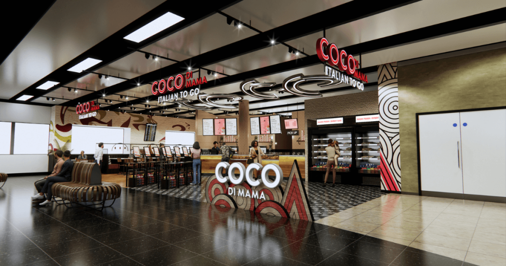
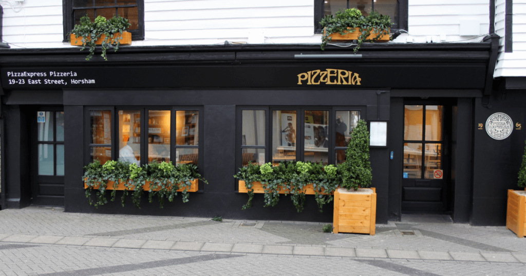
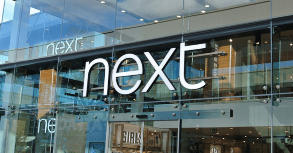
People don’t often spend a great deal of time thinking about fonts but, when you run a business, they are actually pretty important. If you’ve never really thought about it, next time you take a walk down your high street pay close attention to all that business signage above doors and you’ll see what we mean.
Stand out from the crowd
Good signage and a strong font can help you stand out from the crowd. As we all know there are a wide range of different fonts available and each has its own, individual characteristic. The science around the choice of fonts is actually quite complicated and brands will spend a large amount of time and effort finding just the right one for their business.
Many of the old style fonts that have been around for centuries have small flourish in their design (for example, Times New Roman), something that was initially included to make them similar to handwriting. These fonts are mostly seen in pieces of large text where ease of reading is important.
Reflect your business personality
There are transitional fonts like Baskerville which were developed later and are more focused on being uniform and tidy. They may have developed because of our increasing focus on science and they are certainly easy to read – often they’re used for websites because they have that inherent readability. For example, if you want to make sure that people with impaired vision or reading disorders can better read your text, transitional fonts like Arial are usually the first choice.
Modern fonts can often be quite quirky, full of flourishes and look great if you want something artistic – they can also be a little difficult to read on occasion. Take a look at a Moderno or Bodoni font and you’ll see different line thicknesses and various artistic idiosyncrasies. What you need to think about when you choose any font for your business is how it looks across all your signage. A font that looks brilliant above the door, for example, may not be so great when you transfer it to the menu in your restaurant or the text in a promotional brochure.
One good option is slab serif which seems to have been specifically designed for advertising. These are the font types that cry out for attention and include Clarendon and Rockwell. You’ll find coffee shops like Costa and Nero using these to great effect.
Wide choice of fonts
With such a wide choice available, it can be challenging to find just the right font for your business. One tip is to take a look at other providers in your sector and what font they are using. You don’t have to opt for the same – indeed it can often cause problems if you are a small business and go for something similar to a large competitor. They might believe you are trying to copy their brand and that can cause legal issues.
Ideally you want a font that is easily recognisable and which people can read without having to squint up their eyes. It should stand out from the surrounding crowd, especially if you’re operating on the high street, but it also needs to be readily transferrable so that it looks good across a variety of mediums. And you need to be aware that, just because you like a font, doesn’t mean that it suits your business perfectly.
Get great advice on fonts and signage from the team at Technical Signs to make your business signage really stand out from the rest!


