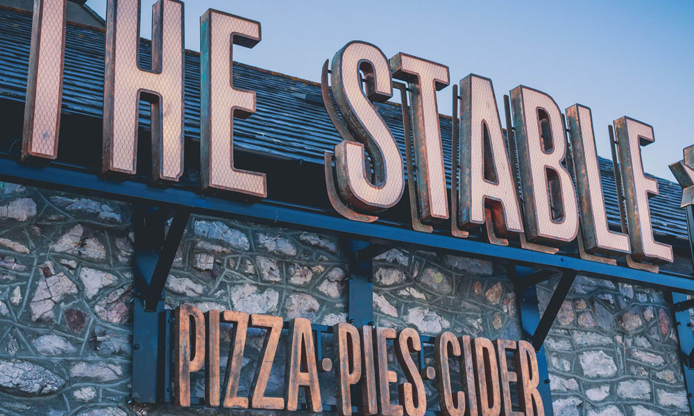
Metal finishes can transform signage from a purely practical element into an architectural feature. The same lettering or sign panel can feel warm and traditional, dark and industrial, or clean and contemporary depending on the material and finish selected.
Patina, blackened steel and brushed metals are often chosen for bespoke signs because they offer more depth and character than a standard painted surface. They interact with light, complement surrounding materials and can help signage feel integrated with the building rather than simply attached to it.
However, these finishes do not all behave in the same way. Some are deliberately varied and continue to develop over time, while others need careful maintenance to preserve a consistent appearance. Understanding how each finish looks in a real environment, where it performs best and what upkeep it requires is essential when planning architectural signage.
Why Specialist Metal Finishes Make a Difference
A metal finish affects much more than colour. It changes how a sign reflects light, how visible fingerprints and weathering will be, and whether the finished installation feels refined, rugged or naturally aged.
Smooth, reflective metals tend to look precise and contemporary. Darker finishes can create contrast against pale stone, brick or concrete. Patinated surfaces introduce tonal variation that can make a sign feel established and individual.
These qualities are particularly valuable in places where signs form part of a wider interior or architectural scheme. Hotels, restaurants, offices, heritage properties and premium retail spaces often require signage that communicates information without looking generic.
The right finish can connect the sign with door furniture, lighting, balustrades, furniture or cladding. This creates a more coherent visual identity across the space.
What Patinated Metal Looks Like in Practice
Patina is a surface effect that gives metal an aged, weathered or chemically altered appearance. Depending on the base metal and treatment, the result may include greens, blues, browns, reds or dark charcoal tones.
Copper and brass are commonly associated with patina. Copper can develop green and blue tones, while brass often takes on deeper brown, bronze or muted gold shades. The finish is rarely completely uniform, which is part of its attraction.
In real spaces, patinated signage tends to feel warm, crafted and individual. The variation catches light differently across the surface, adding depth even when the sign has a simple shape. It works particularly well alongside timber, stone, textured plaster and traditional brick.
Patina is a strong choice for boutique hotels, independent restaurants, heritage developments, artisan retailers and cultural venues. It can also suit contemporary interiors where designers want to introduce a natural or imperfect element.
Because every patinated surface varies, samples are especially important. A small material swatch can help clients understand that tonal differences are intentional rather than manufacturing defects.
Where Patina Performs Best
Patinated metal performs especially well in interiors, sheltered entrances and carefully controlled exterior locations. In these environments, the finish can retain its intended balance of colours while still developing subtle character.
For external bespoke signs, the design must account for weather exposure. Rain, pollution, salt in coastal air and direct sunlight can all influence how the surface changes. Some clients welcome this continuing evolution, while others expect the sign to remain close to the original sample.
A protective coating may be applied to slow further change and reduce marking. However, even sealed patina should not be treated as completely maintenance-free. Coatings can wear, particularly on frequently touched signs such as door plaques or directional panels.
Patinated finishes are less suitable when a perfectly consistent corporate colour is required. Their strength lies in natural variation, so they are best used by brands that are comfortable with a crafted and evolving appearance.
Maintaining Patinated Signage
Patinated signage should usually be cleaned gently. Abrasive pads, metal polishes and strong chemicals may remove or alter the surface treatment. In many cases, a soft cloth and a mild cleaning solution are sufficient.
Cleaning products should always be tested on a discreet area first. This is particularly important when the sign has a waxed, lacquered or specialist sealed finish.
Fingerprints and handling marks can be reduced by positioning signs where customers do not need to touch them. Where regular contact is unavoidable, a suitable protective coating and planned inspection routine will help keep the finish looking deliberate.
Over time, some tonal change may occur. This should be discussed at the design stage so that the maintenance plan reflects whether the aim is to preserve the original finish or allow it to develop naturally.
The Appearance of Blackened Steel
Blackened steel offers a deep, dark finish that retains the character of the metal beneath it. Unlike a flat black paint, it can show subtle variations, grain patterns and blue-grey or brown undertones.
In real interiors, blackened steel feels solid, industrial and sophisticated. It can provide strong contrast against pale walls and natural stone, while blending smoothly into darker colour schemes. Depending on the lighting, the surface may appear almost matt or develop a soft metallic sheen.
Blackened steel is often used for built-up lettering, reception signs, wall plaques, wayfinding panels and feature structures. It works particularly well in converted industrial buildings, restaurants, modern offices, bars and high-end residential developments.
The finish can also be paired with warm lighting. Carefully positioned illumination reveals the texture of the surface and prevents dark lettering from disappearing into its background.
Where Blackened Steel Works Best
Blackened steel is particularly effective indoors, where moisture and environmental exposure are easier to control. Reception areas, hospitality interiors and office developments allow the material to create impact without facing constant weathering.
For exterior architectural signage, additional protection is usually required. Steel can corrode when exposed to moisture, so the surface treatment and sealing system must be suitable for the location.
Drainage, fixings and installation details are also important. Water should not be allowed to sit behind letters or collect along panel edges. Coastal and highly exposed locations may require an alternative material that creates a similar appearance with greater corrosion resistance.
Blackened steel is ideal when a project needs a dark finish with more character than powder coating. However, clients should understand that slight variation is a feature of the material rather than a flaw.
Keeping Blackened Steel Intentional
The main maintenance priority with blackened steel is protecting the surface from moisture, scratching and unsuitable cleaning products.
Dust can normally be removed with a soft cloth. For more thorough cleaning, a lightly dampened cloth may be suitable, provided the surface is dried afterwards. Abrasive cleaners should be avoided because they can damage the protective coating and expose brighter metal beneath.
High-contact areas may gradually become polished or marked. This can add character in some settings, but it may appear uneven in a formal corporate environment. Positioning, protective treatments and scheduled inspections should therefore be considered early.
Any scratches or coating failures should be addressed promptly, especially on exterior signs, before corrosion spreads beneath the finish.
How Brushed Metals Look in Real Spaces
Brushed metal has a directional grain created by finishing the surface with fine abrasive lines. It offers a softer and more controlled appearance than polished metal because it reflects light without producing a mirror-like shine.
Brushed stainless steel is widely used in modern signage because it feels clean, professional and durable. Brushed brass and bronze provide the same linear texture with warmer colour, making them suitable for luxury hospitality, retail and residential developments.
In real spaces, brushed finishes respond attractively to changing light. The grain gives flat panels and letters a sense of movement while helping to disguise small surface imperfections.
These finishes suit reception signs, directories, door plaques, external lettering and branded interior features. They pair particularly well with glass, concrete, stone and minimalist interiors.
Where Brushed Metals Perform Best
Brushed stainless steel is one of the most versatile choices for both interior and exterior bespoke signs. The correct grade should be selected for the environment, particularly in coastal or heavily polluted areas.
Brushed brass and bronze are often preferred indoors or in sheltered locations, especially when maintaining a warm, premium appearance is important. Left unsealed, they may naturally darken and develop a patina. A protective coating can help preserve the original colour.
The direction of the grain should be consistent across every component. Misaligned brushing can make an otherwise high-quality sign appear poorly planned, especially when several letters or panels are viewed together.
Protecting Brushed Finishes Over Time
Brushed metals should be cleaned in the direction of the grain. Wiping across it may leave visible marks or create an uneven appearance.
Soft cloths and non-abrasive cleaners are normally recommended. Fingerprints are more noticeable on some finishes than others, so signs positioned at hand height may require more frequent cleaning.
Stainless steel can develop surface staining if contaminants are allowed to remain, particularly outdoors. Routine cleaning removes deposits before they affect the appearance. Brass and bronze require a clear decision about whether natural ageing is welcome or whether the original finish should be maintained.
Choosing a Finish That Ages With Purpose
The best specialist metal finish is not simply the one that looks most attractive in a sample. It must suit the building, lighting, level of contact, environmental exposure and maintenance resources available.
Patina offers warmth and natural variation. Blackened steel creates depth and industrial elegance. Brushed metals provide controlled texture and versatile performance. Each can elevate bespoke signs when its natural characteristics are understood.
By planning finishes, coatings, installation details and cleaning routines together, businesses can ensure their architectural signage continues to look intentional. A finish that ages well does not have to remain unchanged, but every change should support the character of the sign rather than make it appear neglected.