A menu board has to do more than list food and drink. In a busy restaurant, café, takeaway or bar, it must help customers understand the offer quickly, compare options and make a confident decision without holding up the queue.
The most effective menu signs combine clear information with strong visual structure. They guide the eye towards important categories, make prices easy to understand and give high-value or popular items the right level of prominence. They also need to be practical for staff, especially when dishes, availability and prices change regularly.
A menu board that looks attractive but is difficult to read can frustrate customers and slow service. Equally, a system that is easy to update but visually inconsistent can weaken the wider brand. Good planning allows restaurant signs to remain clear, flexible and commercially effective throughout day-to-day use.
Start With the Customer’s Decision
Before choosing fonts, colours or materials, consider what customers need to decide when they look at the menu.
A coffee shop customer may need to choose a drink type, size, milk option and extra flavour within a few moments. A takeaway customer may be comparing meal deals, side dishes and upgrades. In a restaurant, customers might be looking for vegetarian dishes, children’s options or set-menu prices.
The menu structure should follow this decision-making process. Information needs to appear in the order customers are most likely to use it, rather than simply reflecting how the kitchen or stock system is organised.
For example, a café board might begin with coffee, followed by tea, cold drinks and food. A fast-casual restaurant could lead with main categories, then show customisation options and extras separately. When the board reflects the customer journey, ordering becomes easier and more efficient.
Create a Clear Visual Hierarchy
Visual hierarchy tells customers where to look first, second and third. Without it, every item appears equally important and the board becomes tiring to scan.
The main categories should be the most prominent elements. Headings such as Breakfast, Burgers, Hot Drinks or Desserts need to be clearly distinguishable from individual product names. This can be achieved through size, weight, spacing or colour, but the approach should remain consistent across the whole display.
Product names should usually come next in the hierarchy, followed by descriptions and prices. Supporting details, such as allergens, serving notes or upgrade options, should be visible without competing with the core choices.
Businesses can also use hierarchy to highlight priority products. A signature dish, popular combination or high-margin item may receive slightly more space or a distinct panel. However, overusing emphasis has the opposite effect. When everything is highlighted, nothing stands out.
Use Space to Improve Readability
One of the most common problems with menu signs is overcrowding. Businesses often try to include every possible choice, description and variation on one board. This may seem economical, but it can make the menu harder to use.
White space, or empty space around text, is essential for readability. It helps separate categories and prevents lines of information from blending together. A board does not need to be filled edge to edge to justify its size.
Margins should be generous enough that wording does not feel trapped against the frame. Category sections should have consistent gaps between them, while product names and descriptions should remain visually connected.
Line spacing is also important. If lines are too close together, customers can easily read across the wrong row and match a price with the wrong item. If they are too far apart, the relationship between the product and its details becomes unclear.
A balanced layout allows customers to scan quickly while still understanding how each piece of information is grouped.
Choose Type That Works at a Distance
A font may look stylish on a computer screen but become difficult to read when installed above a counter. Viewing distance, lighting and customer movement all affect legibility.
Simple, well-formed typefaces are usually the safest choice for main menu information. Highly decorative lettering can be reserved for short headings or brand details, rather than long product lists.
Letter size should be based on where customers will stand. A board positioned high on a wall requires larger text than a countertop menu. Designers should also account for customers with varying eyesight and avoid making descriptions unnecessarily small.
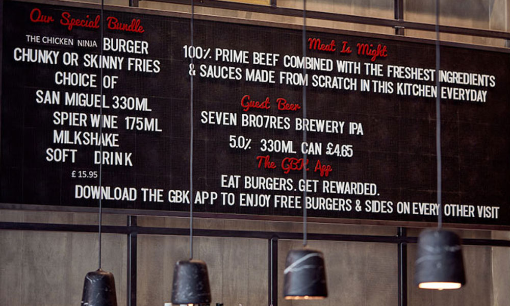
Strong contrast between the lettering and background is essential. Light text on a dark panel can work well, as can dark text on a pale background. Mid-tone colour combinations may look sophisticated close up but become indistinct from several metres away.
Capital letters should be used selectively. Entire paragraphs or long lists in capitals are harder to scan than mixed-case text. Clear upper- and lower-case lettering usually gives menu signs a more approachable and readable appearance.
Make Pricing Easy to Compare
Price layout has a significant effect on how customers read a menu. Prices need to be clear, but they should not overpower the product names or encourage customers to focus only on cost.
Aligning prices in a neat column makes comparison easy and gives the board a clean appearance. This works particularly well when items have one fixed price. Care is needed, however, because a strongly defined price column may lead customers to scan vertically for the cheapest option rather than reading the dishes.
Another approach is to place the price close to the product name or at the end of the description. This keeps the cost connected to the value and character of the item.
Where products come in several sizes, a simple grid may be the clearest solution. Size labels should appear once at the top of the section, with prices aligned beneath them. Repeating words such as small, medium and large on every line wastes space and makes the display feel cluttered.
Currency symbols can often be reduced or omitted when it is already obvious that the figures are prices. Consistent decimal formatting is also important. Mixing whole numbers with different decimal styles can make restaurant signs appear untidy.
Keep Descriptions Short and Useful
Descriptions should help customers understand why they might choose an item. They should not repeat information that is already obvious from the product name.
A useful description may mention the main ingredients, cooking style or a distinctive benefit. It should remain short enough to scan quickly, particularly on overhead boards.
Long descriptions can create uneven blocks of text and force the lettering to become smaller. When extensive detail is necessary, a printed menu, table menu or digital screen may be a better format.
Dietary symbols can reduce the need for repeated wording, provided they are clearly explained. Vegetarian, vegan, gluten-free and spicy items can be identified with simple icons or abbreviations. These markers should be positioned consistently so customers can find them quickly.
Allergen information should be handled carefully and supported by an appropriate process for providing accurate details. The menu board can direct customers to speak with staff or consult a separate allergen guide where necessary.
Choose a Format That Matches the Rate of Change
Different menu formats suit different levels of updating. A permanent sign panel may be ideal for a stable core menu, but it becomes inconvenient when prices or products change frequently.
Magnetic menu systems allow individual names and prices to be replaced without remaking the entire board. They work well for cafés, bakeries and takeaways with regular seasonal changes.
Slotted letter boards offer a traditional appearance and can be updated by staff. They are flexible, although changing a large menu can be time-consuming and spare characters need to be organised carefully.
Chalkboards suit informal hospitality environments and daily specials. Their effectiveness depends on neat, consistent lettering. Handwritten content should still follow a clear grid rather than being added wherever space is available.
Printed interchangeable panels provide a more controlled branded appearance. Sections can be designed to standard sizes and replaced when needed. This is useful for seasonal ranges, promotional meals and rotating menus.
Digital menu screens offer the greatest flexibility. Prices, availability and promotions can be changed quickly across one or several locations. However, they need reliable hardware, suitable content design and a plan for technical faults. Animations should be used sparingly so customers have enough time to read each screen.
Design for Staff as Well as Customers
An updateable system only works when employees can use it confidently. Staff should understand how to change items without damaging the layout or creating inconsistent formatting.
Templates, spacing guides and approved wording styles can help maintain standards. Spare letters, magnetic strips or printed panels should be stored in a labelled location. Digital systems should have clear access permissions and a straightforward approval process.
It is also sensible to identify which information changes daily, seasonally or rarely. Permanent brand elements and category headings can remain fixed, while prices, specials and availability use flexible components.
This combination reduces the amount of work involved in routine updates while preserving a professional appearance.
Review the Board in Real Conditions
Menu boards should be tested from the customer’s actual viewing position. Designers and business owners need to step back, consider queues and check how lighting affects the display at different times of day.
Glare can make glossy panels unreadable, while shadows may obscure sections of text. Hanging lights, shelves or decorations can also block sightlines. A board that works in an empty venue may be harder to see when customers are standing at the counter.
Regular reviews help identify outdated prices, damaged panels, inconsistent spacing and items that customers frequently misunderstand. These observations can guide future updates.
Turning a Menu Into a Better Sales Tool
Successful menu signs reduce effort for both customers and staff. They organise choices into a logical hierarchy, use space carefully and present prices without allowing them to dominate.
The right format also makes changes manageable. Whether the business chooses magnetic panels, chalkboards, interchangeable graphics or digital displays, the system should match how frequently the menu evolves.
Well-designed restaurant signs do not simply display information. They guide attention, support faster ordering and help customers notice the products the business most wants to sell. With clear rules and a practical updating plan, a menu board can remain useful, attractive and commercially effective every day.