
When you mention colour theory to a business owner, you might not be that surprised when they have never heard of it, or do not consider important for their business. Colours, however, are an important aspect of branding and sign design. Whether it is the red and white of the Coca Cola logo or the quirky colour design of your local café, it all has an impact.
The right combination not only helps you stand out from the crowd but can elicit positive emotion in your potential customers and the team at Technical Signs can help you make the best decisions for your business.
Colour Theory & Business Success
You might be surprised to learn that there is a set of rules related to using colours together. Speak to any interior designer and you will find out how important it is. For businesses looking to stand out, it is about choosing the right mix of colours that help them shine among the competition.
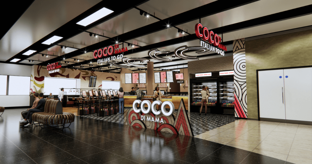
Colour is a difficult area to understand. You have three primary colours (red, blue, and yellow) and a million other colours that are made up of combinations of these three. Some colours like red and green or yellow and purple are complimentary. That means they help each other stand out more vibrantly. Some colours are associated with emotions. Red can create energy and emotion. Blue can leave us feeling calm and at one with the world. Which is best for your business.
How to Use Colour Theory in Your Sign Design
This can be a complicated business if all you want is to get noticed on the high street with your signage. It is worth taking a step back, however, and looking at different combinations that are likely to work.
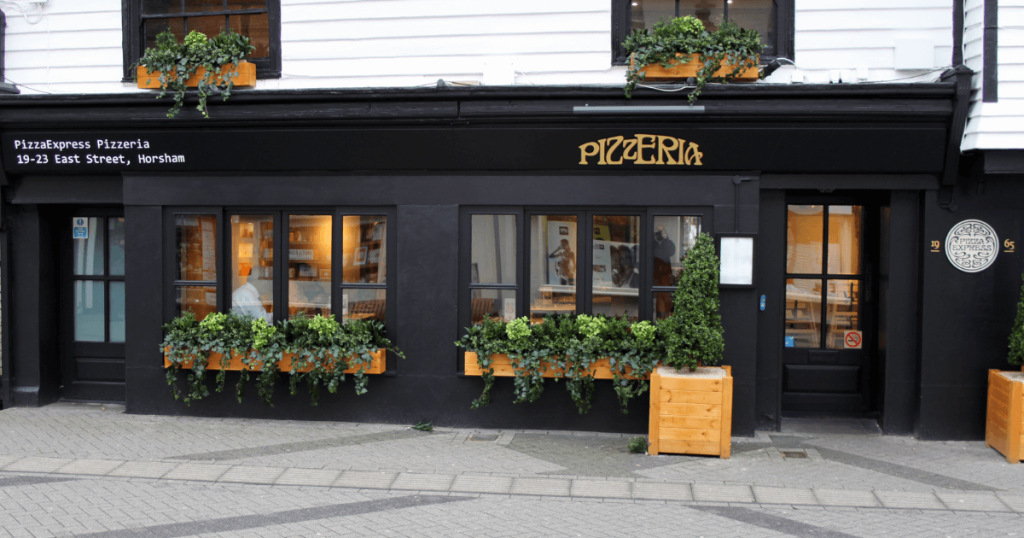
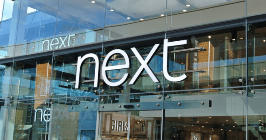
First of all, you might have an established brand colour combination. It may work well on your website or your promotional literature, but the key is how it works for your bricks and mortar store. Our advice is to step outside and take a look at it from your customer’s point of view. Does it stand out on the high street? Does it create emotion? Does it drive customers to your door?
It pays to delve a little deeper into the world of colour and the emotions that it can support. For example, reds, yellows, and oranges are associated with higher levels of arousal. Blues and greens are a little more mellow. Shades and combinations of different colours, however, can make a big difference.
Let’s say that you run a spa in your local town. Colours like blue and violet are perfect for creating a serene sign that affirms what your customers are looking for. Swap that for a vibrant red, however, and you could find your potential customers thinking twice before they use your services.
Colour Choices Make a Difference
Finally, it’s useful to look at the colour combinations that your competitors are using. How do these choices help them stand out? Can you do better?
Although this is a relatively simplistic view, it does underline the importance of colour choice for any sign that you create. With the right combination, you can create greater visibility but also play with the emotions of the people passing by your business daily. Putting more focus on colour when it comes to signage can make a hu ge difference.
If you liked this post, why not try another? Take a look at our latest blog post; ‘Alternatives to the Classic A-Board Sign’ for a refreshing take on a classic!